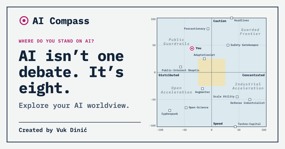
Ask someone what they think about AI and you will usually get an answer on a single scale. They are excited or they are worried. They are an optimist or a doomer. Headlines use the same scale, and so do most dinner-table arguments.
I think that scale is the wrong shape for the disagreement. So I built AI Compass, a short quiz that asks about eight different questions and shows you where you land on each. This post is about why.
One line is not enough
Imagine two people.
The first thinks advanced AI could go badly wrong and wants strong rules before anyone builds more of it. She also wants models to be open, because she trusts a few large companies even less than she trusts the technology.
The second is not worried about catastrophe at all. He thinks the risk talk is mostly marketing. But he is very worried about who ends up owning the gains, and he would tax AI profits tomorrow.
On the optimism-to-doom line, she is a pessimist and he is an optimist. Yet on the question of who should hold power over AI, they agree with each other and disagree with most of the people standing next to them on that line. The single scale puts them in opposite corners and misses the one thing they share.
This is an ordinary problem in social science. When opinions vary along several dimensions and you force them onto one, you get strange bedfellows and false enemies. Political scientists have long argued about how many dimensions it takes to describe left and right. I see no reason AI should be simpler.
AI is a political question as much as a technical one
I have written before about how rarely we talk about what AI does to our political systems. The same blind spot shows up in how we sort opinions about it.
Whether a model can be controlled is partly a technical question. Who is allowed to run it, who pays when it replaces work, whether armies should use it, and where the computing power sits are not technical questions at all. They are questions about power, ownership and trust, which is to say they are political. People answer them with the values they already hold about markets, states and institutions, and those values do not line up neatly with how impressed or frightened they are by the technology.
Where the idea came from
The starting point was Kristin Houser’s article “10 perspectives that divide the AI world” for Big Think. It sorts the debate into ten tribes, and it is a good map. Reading it, I kept wanting to turn it sideways. The tribes seemed to differ along a smaller set of underlying questions, and a person could plausibly sit with one tribe on one question and with another tribe on the next.
AI Compass is what came out of that. I want to be clear about the relationship: it is an independent interpretation inspired by the article. The dimensions, the statements, the scoring and the reference camps are mine, and so are their flaws. It is not affiliated with the author or with Big Think.
How it is built
I ended up with eight dimensions: risk, pace, access, war, labor, compute, architecture and wealth. Each is one question with two poles and a named middle ground. “Access”, for example, runs from open models that anyone can run to closed models held by a few licensed institutions.
Every dimension has six statements, three written from each pole. That balance matters. If all the statements leaned one way, a person who tends to agree with things would drift toward that pole without meaning to. You answer on a five-point scale, and the score is how much more you agree with one side than with the other. A statement you skip is left out. It is not quietly counted as neutral, because “I don’t know” and “I’m in the middle” are different answers.
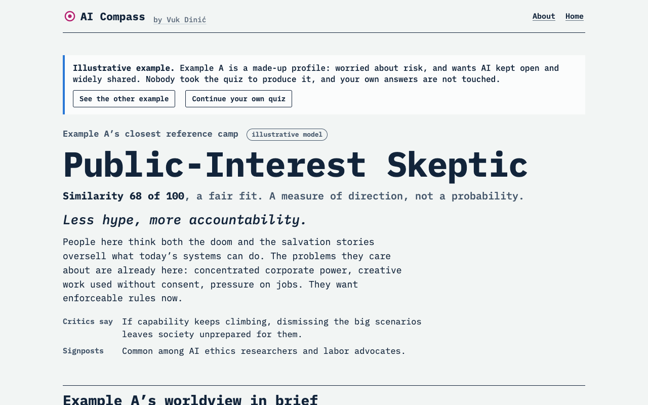
There is a short route with 16 statements and a full one with 48. The short one gives a provisional result, and says so.
The result leads with all eight dimensions. There is also a two-dimensional compass, because a map is easier to take in at a glance, but it only uses five of the eight, and the page says that too. Finally there are eleven reference camps: hand-written profiles of recognizable positions in the debate. The quiz tells you which are closest and on which dimensions you part ways with them.
What the eight dimensions show
The camps make the point by themselves. Written down as eight numbers each, very few of them are consistent “pro” or “anti” packages. A camp that wants to move fast can also want AI concentrated in a few hands, or spread across everyone’s laptops. A camp that fears extinction can be for or against military use. Positions that look like natural partners on the one-line view often come apart, and positions that look like opposites sometimes travel together.
The quiz has a small feature built on this. In your summary it looks for the pair of your clear positions that the fewest camps share. When there is one, it is a combination that no ready-made tribe offers. I find that the most interesting line in the result, because it is where a person’s thinking is most their own.
Exploratory, not validated
I should be plain about what this is. AI Compass is an exploratory educational tool, not a scientifically validated psychological or political test.
In my own field, a scale that claims to measure an attitude has to earn that claim. You test the wording on real respondents. You check that the items meant to measure one thing hang together, that the dimensions are distinct, and that the results are stable over time. None of that has been done here. The statements are my wording, the dimensions are my reading of the debate, and the camps are illustrations. The public figures mentioned beside some camps are signposts based on what they have argued in public; none of them took the quiz.
I did not want to hide this behind a confident-looking chart, so the app repeats it in several places, and it avoids percentages that could be read as “you are 72% this kind of person”. A similarity score tells you two patterns point the same way. It does not tell you who you are.
There is also no data collection. Your answers stay in your browser. Studying how people answer would need consent, a proper design and ethical review, and it would be a different project.
Why disagreement is worth mapping
If it is not a measurement, why build it?
Because I think the useful part is the conversation afterwards. When two friends compare results, the app shows where they agree most, where they differ most, and gives them a question to talk over. The hope is that this replaces “we disagree about AI” with something more exact, such as “we disagree about two things and agree about six”.
That matters for more than dinner. Decisions about AI are going to be made through politics: through regulation, public spending, treaties and elections. Deliberation works better when people can say exactly what they disagree about. A debate with eight questions is harder to follow than a debate with one, but it is also easier to make progress in, because you can settle some questions while still arguing about others.
Try it
AI Compass takes three minutes for the quick route and about eight for the full one. There is no account and nothing to install. The project page has more on the method and its limits, and the code is on GitHub.
If a statement seems loaded, or a dimension seems to be missing, I would like to hear it. That is the kind of disagreement the tool is for.